POSTERS/MAGAZINE ADS
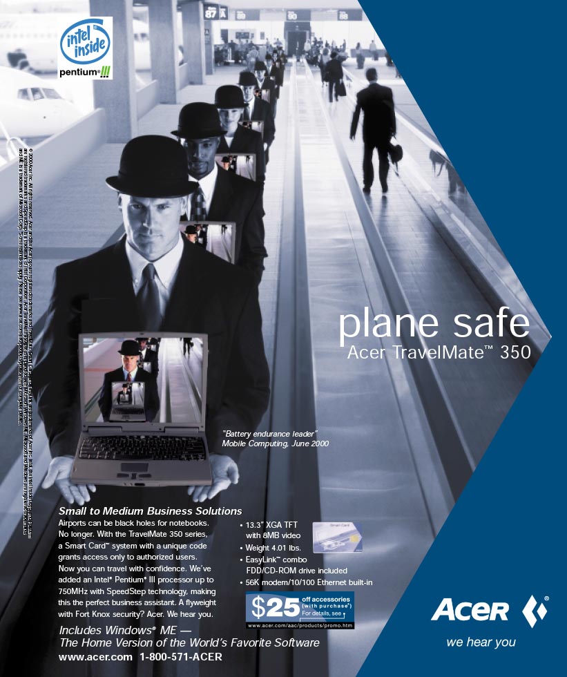
Acer Magazine Ad: plane safe
OBJECTIVE:
Design of a magazine ad for the company Acer.
DIRECTION:
Target the laptop/commuter market.
NOTES:
The ad identity guidelines were already established by Acer. They bought this campaign direction and I assembled the photoillustration once principal photography of the models, the laptop computer, and the airport were completed.
Acer Magazine Ad: mobility
OBJECTIVE:
Design of a magazine ad for the company Acer.
DIRECTION:
Target the laptop/commuter market.
NOTES:
The ad identity guidelines were already established by Acer. They bought this campaign direction and I assembled the photoillustration once principal photography of the models, the laptop computer, and the light-rail were completed.
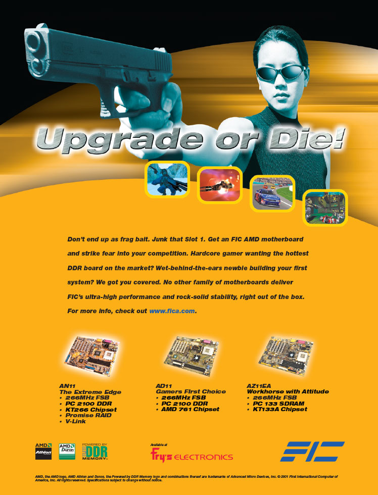
FIC Maximum PC Ad
OBJECTIVE:
Design of a magazine ad for the motherboard company FIC.
DIRECTION:
Target the gamer market.
NOTES:
The gaming community is very competitive and is known for upgrading more often than the common user so that their gaming experience will be most satisfactory and perhaps give them an edge over their competition. I used the mentality of “Upgrade or Die!” and the imagery of a sexy armed woman and combined them for an appealing effect for the gamer market.
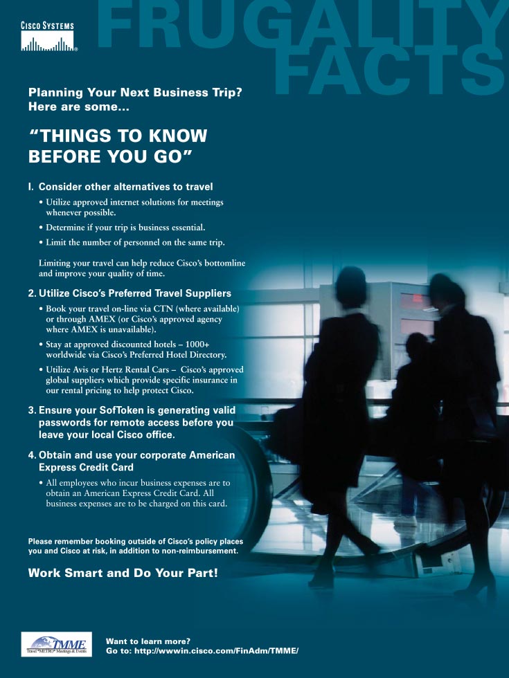
Frugality Facts: Things to Know Before You Go
OBJECTIVE:
To revamp the existing Frugality Facts poster series.
DIRECTION:
Create a unique and easily identifiable brand of posters.
NOTES:
The previous Frugality posters had no style guidelines in their layout and typography. I used the Cisco green as its foundation and developed a typography style that the employees can easily follow from iteration to iteration.
Frugality Facts: Cisco’s Employee Discount Program
OBJECTIVE:
To revamp the existing Frugality Facts poster series.
DIRECTION:
Create a unique and easily identifiable brand of posters.
NOTES:
The previous Frugality posters had no style guidelines in their layout and typography. I used the Cisco green as its foundation and developed a typography style that the employees can easily follow from iteration to iteration.
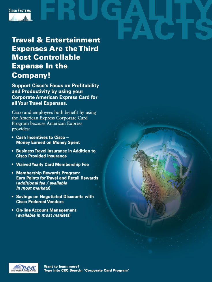
Frugality Facts: Travel & Entertainment Expenses
OBJECTIVE:
To revamp the existing Frugality Facts poster series.
DIRECTION:
Create a unique and easily identifiable brand of posters.
NOTES:
The previous Frugality posters had no style guidelines in their layout and typography. I used the Cisco green as its foundation and developed a typography style that the employees can easily follow from iteration to iteration.
CORPORATE BROCHURES
e21corp
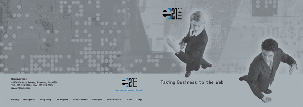
e21corp Tech Brochure: Outside Cover
OBJECTIVE:
To showcase various technologies offered at e21corp.
DIRECTION:
Utilize strong color and silver metallic inked photographic imagery as a platform to present their company as bold and forward-thinking.
NOTES:
East-West fusion is represented by the Western models posing in Tai-Chi stances. Smaller photographs are placed within a grid pattern to represent the section(s).
e21corp Tech Brochure: Inside Spread
OBJECTIVE:
To showcase various technologies offered at e21corp.
DIRECTION:
Utilize strong color and silver metallic inked photographic imagery as a platform to present their company as bold and forward-thinking.
NOTES:
East-West fusion is represented by the Western models posing in Tai-Chi stances. Smaller photographs are placed within a grid pattern to represent the section(s).
Unigen
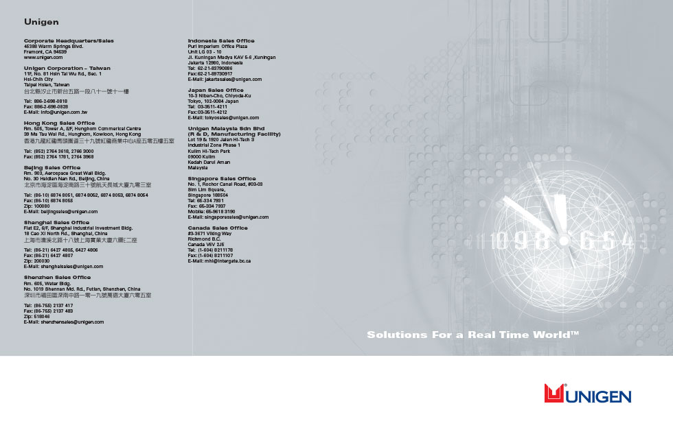
Unigen: Outside Cover
OBJECTIVE:
Corporate brochure design showcasing various aspects of the company.
DIRECTION:
Utilize strong color and silver metallic inked photographic imagery as a platform to present their company as bold and forward-thinking.
NOTES:
By using a two-page spread for each section, I was able give plenty of room for a main visual image that represents each respective section. I used a simple two-column layout for the text for English and Chinese translations.
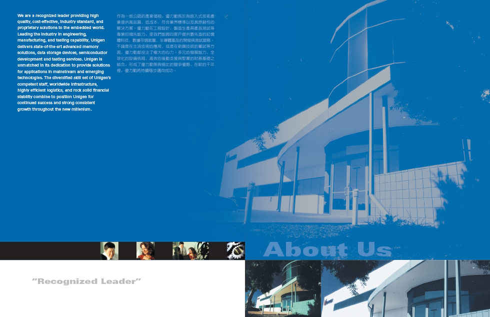
Unigen: Inside Spread
OBJECTIVE:
Corporate brochure design showcasing various aspects of the company.
DIRECTION:
Utilize strong color and silver metallic inked photographic imagery as a platform to present their company as bold and forward-thinking.
NOTES:
By using a two-page spread for each section, I was able give plenty of room for a main visual image that represents each respective section. I used a simple two-column layout for the text for English and Chinese translations.
